
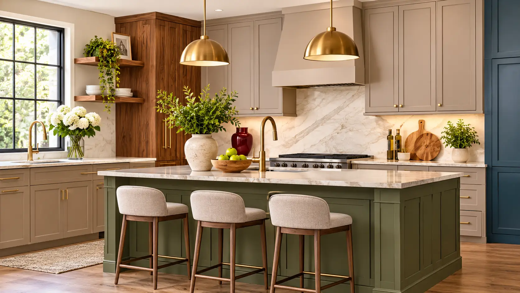
Choosing from the many kitchen cabinet colors on offer is a bigger decision than choosing a wall color, because cabinets are the most expensive thing you will paint or buy for the room, and you will look at them every day for years. A trend that feels fresh this year can feel dated by the time the project pays itself off.
So this guide does two jobs. It shows the kitchen cabinet colors that designers and manufacturers expect to be popular in 2027, and it gives you a way to decide whether any of them belong in your kitchen. A small first step: pull out three cabinet colors you already like and keep them open as you read.
One note on the evidence. Color forecasts are predictions, and many of the sources below are cabinet sellers with something to sell. Where that matters, we say so.
Quick answer
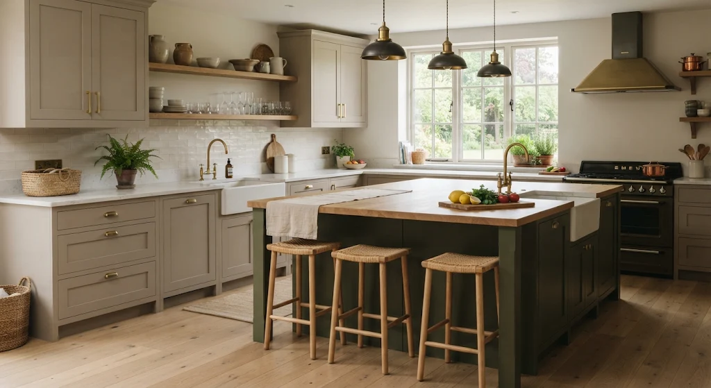
The 2027 forecasts lean warm and earthy: taupe and warm neutrals, muted olive and heritage greens, walnut and soft brown wood tones, creamy whites, plus smaller niches of burgundy, aubergine and muted blue. Homes & Gardens and Artezia agree on the warm direction, and ProCraft Cabinetry describes the shift as moving the same families from a blue base to a warm one. Pick for your light, floors and counters, and test a large sample first. Forecasts checked November 2026.
Why trends matter less on cabinets
CabinetCorp, a cabinet seller, makes the point that cabinets are a long-term investment and that changing their color later is significant work. It advises looking for the mood and color family behind a trend rather than matching a trend color exactly. Block Renovation says classic shades tend to stand the test of time, and recommends focusing on what appeals to you rather than trends.
That is sensible. A practical way to use a trend is to put it where it is easy to change. CabinetCorp suggests a trend color on the island with timeless perimeter cabinets, or neutral cabinets with trend colors added through paint, hardware, lighting, backsplash or décor.
The shades forecasters expect
Two cabinet-focused guides give the clearest lists. Homes & Gardens (by Molly Malsom, published October 2026) quotes named interior designers. Artezia, a cabinet seller, lists seven shades without naming individual designers.
| Shade family | What the sources say | Source |
|---|---|---|
| Warm taupe and earthy neutrals | Taupe replacing gray and sometimes cream as a base neutral, especially on cabinets; “gray isn’t necessarily gone, it’s simply getting warmer” | Homes & Gardens, Artezia |
| Olive and heritage green | Softer olive expected to replace deep forest green; green described as one of the defining families for 2027 | Homes & Gardens, Artezia |
| Soft brown and chocolate | Browns stay, in lighter, muted tones in one guide and espresso in another | Homes & Gardens, Artezia |
| Natural walnut and warm wood | Wood grain treated as the color itself | Artezia, ProCraft Cabinetry |
| Creamy white and ivory | Warmer whites as an evolution of white; test samples in different light | Artezia |
| Burgundy, wine and aubergine | Muted, earthy versions that pair with natural materials | Homes & Gardens, Artezia |
| Dusty and muted blue, navy | Muted blue-gray to deep navy; dusty blue with maroon is one named pairing | Artezia, Homes & Gardens |
| Ochre with maroon | A bold, warm pairing; one designer says it will “explode” | Homes & Gardens |
Designers quoted by Homes & Gardens give the reasons. One calls olive “less moody, more livable” than darker greens, another loves taupe “as a foundation, particularly on cabinetry,” and another says aubergine “has real depth without feeling loud.” These are opinions, not sales data, so treat them as direction rather than proof.
The warm shift
If you take away one idea, make it this: the common thread is warmth. ProCraft Cabinetry says the change is “the same families as before, moved from a blue base to a warm one,” and that minimalist kitchens in 2026 leaned cool. Artezia says gray is not gone but is getting warmer, with mushroom, taupe, beige and greige replacing cooler grays.
Outside cabinets, ProBuilder reports the same direction in paint, a move “away from cool tones to warm, earthy colors,” and cites Houzz’s 2026 Fall Design Trends report that clients increasingly want warm neutral palettes instead of whites and grays.
The cabinet-specific takeaways are simple. A cool white or gray kitchen is not wrong, but if you are choosing now, a warmer version of the same family is the safer bet. For more on white against wood, see how to weigh painted white against wood grain.
Finish and two-tone trends
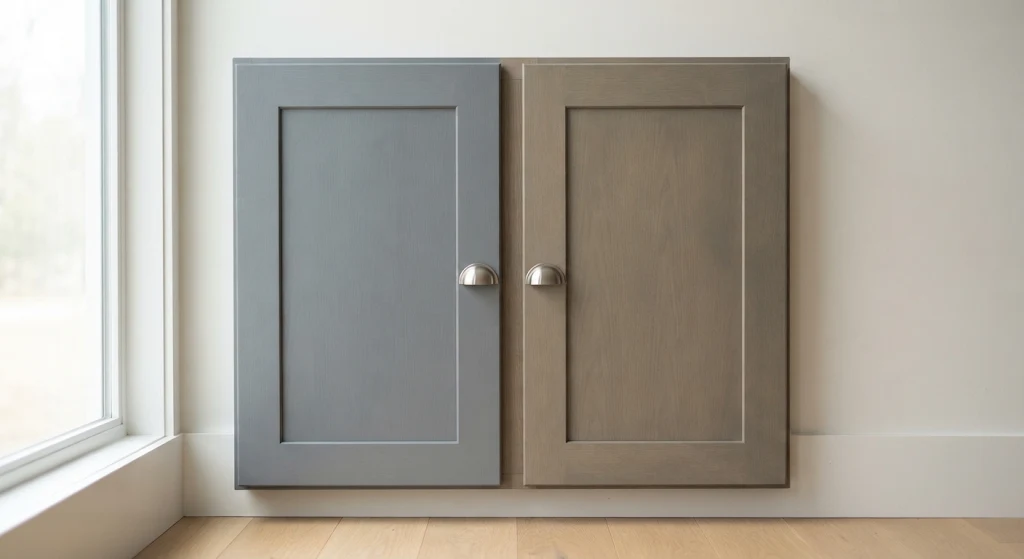
Color is only half of what you see. ProCraft Cabinetry makes three points, based on its observations at KBIS 2026 and not on sales or survey data.
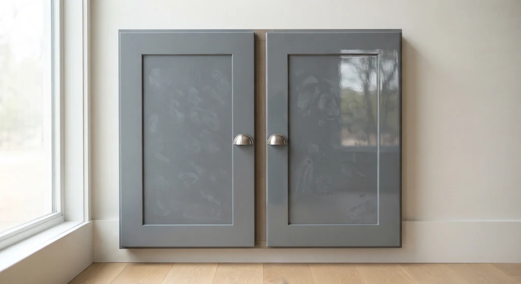
- Ultra-matte over high gloss. It says matte finishes hide fingerprints and glare better, and that several newer matte finishes are fingerprint-resistant.
- Softer two-tone. It notes fewer high-contrast pairings, such as white cabinets with a navy island, and more closely related tones, like warm neutrals with natural wood.
- Wood as a feature. It points to species such as white oak and walnut, treated as the design itself.
Another cabinet seller, Discount Kitchen Direct, pairs the darker paint colors in Sherwin-Williams’ 2027 forecast with its own sage, navy and black cabinets, which is a reminder to read seller pairings with care. If you want an island in its own color, see give an island its own color.
What the paint colors of the year add
Paint brands have named their 2027 colors, and they tell you about mood more than cabinets. Midwest Design lists Sherwin-Williams Celery, Benjamin Moore Webster Green, Behr Grounded (a warm green between olive and moss), Valspar Cottage Door (a blue), and Dutch Boy Deep Rooted (an earthy orange). Homes & Gardens adds Dulux Soulful Sage and Graham & Brown Rose Earth.
| Brand | 2027 color | Family | Source |
|---|---|---|---|
| Sherwin-Williams | Celery | Soft green | Midwest Design |
| Benjamin Moore | Webster Green | Green | Midwest Design |
| Behr | Grounded | Olive-moss green | Midwest Design |
| Valspar | Cottage Door | Blue | Midwest Design |
| Dutch Boy | Deep Rooted | Earthy orange | Midwest Design |
Our read: green shows up on both the paint list and the cabinet lists, so it is the closest thing to a consensus. These picks were chosen for walls and general design, not as cabinet forecasts, so the cabinet lists above are the better guide for this room.
How to choose your color
This is the part that matters more than any list. Block Renovation gives a clear process, and a few other sources add to it.
- Pick one undertone family. Allie Weiss, quoted by Block Renovation, says tones lean warm or cool, and to stick with one family throughout the space.
- Treat floors and counters as anchors. Block says your cabinet color should work in harmony with them. Bold patterns call for calmer cabinets, and plain surfaces give more room for color. Earthy stone pairs well with warm grays, taupes or deep greens.
- Think about light. Block says north-facing rooms feel cooler and can make blues and greens more pronounced, and that rooms with little natural light suit lighter shades.
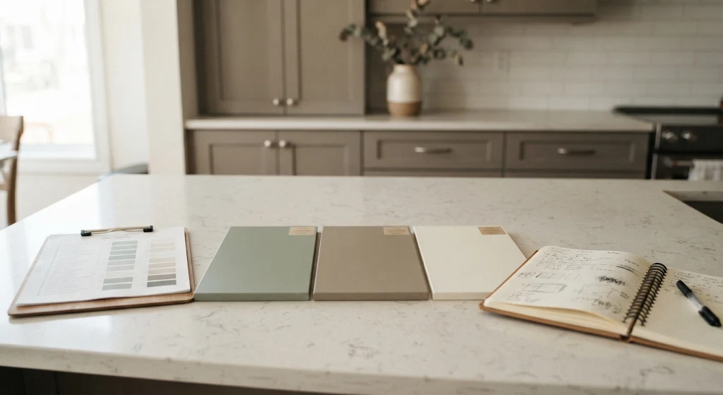
- Test a large sample. Paint it on a door or poster board, check it at different times of day, and live with it for a couple of days, per Block. Artezia adds that warm whites in particular should be tried in different light, since undertones shift.
- Decide on the finish. A matte and a satin of the same color look different, so sample the finish you will actually buy.
Metal finishes change how a color reads, so choose metal finishes that suit your color choice at the same time. For an existing kitchen, the question is how to steps for repainting what you already own, and for sound boxes you can also consider refacing as a way to change color.
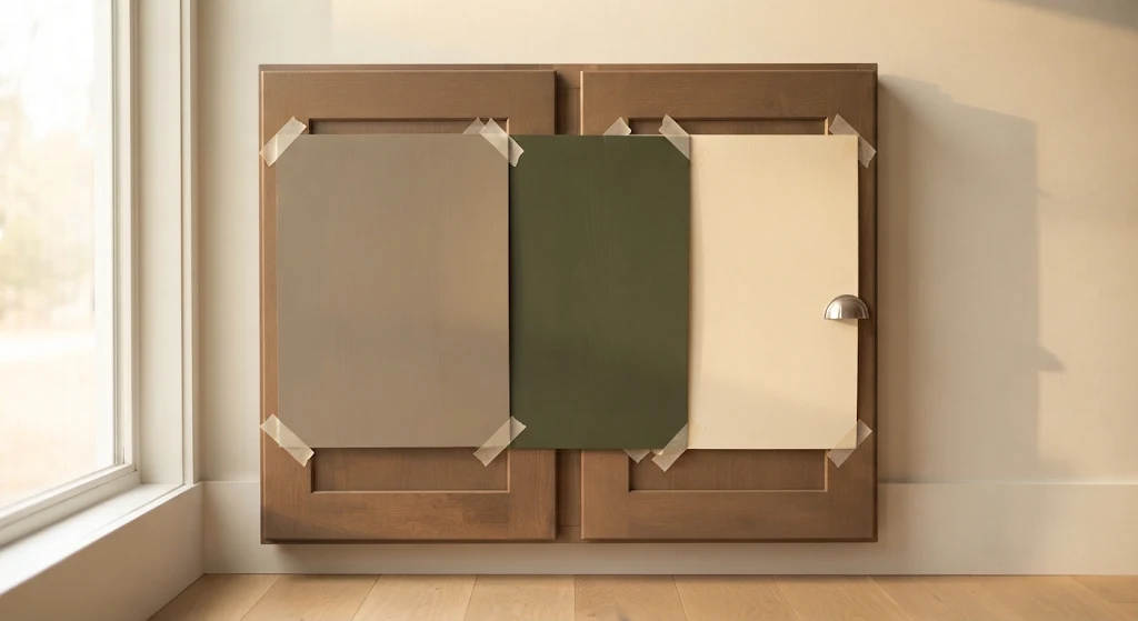
If you are torn between two colors, test both on the same door in the morning and evening, and cross one off on the first day. A decision made in two days of sample-checking is much cheaper than one made after the doors are painted or ordered.
If you are comparing prices for different cabinet finishes, see what cabinets cost before choosing a premium finish.
Where the guides differ
| Topic | What the sources say |
|---|---|
| Browns | Lighter, muted browns (Homes & Gardens); espresso and chocolate (Artezia) |
| Greens | Softer olive replacing deep forest (Homes & Gardens); heritage green and earthy olive (Artezia); light, fresh Celery as paint (CabinetCorp) |
| Whites and grays | Warm whites and warmer grays (Artezia); no 2027 shade named by ProCraft Cabinetry |
| Blues | Dusty blue with maroon (Homes & Gardens); muted blue-gray and deep navy (Artezia); fewer high-contrast navy pairings (ProCraft Cabinetry) |
The sources agree on the direction and disagree on the details, which is normal for forecasts. The sellers also have products to promote, and none of the pages we read cites sales data.
Common mistakes and mental traps
- Choosing from a screen or a photo. Colors shift with light, as Block notes. Always test in your room.
- Following one trend color to the letter. CabinetCorp suggests looking for the mood and family instead.
- Mixing undertones. A warm cabinet with a cool floor can look off, per Block’s one-family advice.
- Timeline optimism. You may want to pick a color in a day. Give it a couple of days with a big sample.
- The “while we’re at it” upgrade. A new color often triggers new counters, hardware and lighting. Set a limit before you start.
- Sunk cost. If a sample looks wrong after two days, drop it. Do not keep it just because you already spent time on it.
- Trend over life. A color you enjoy on an island or in small doses is safer than a bold choice across the whole room.
General information, not advice
This guide shares general design information and forecasts. Trends are predictions from designers and sellers, not guarantees of resale value or future taste. Check your cabinet supplier for the finishes and colors it actually offers.
Color-choice checklist
- ☐List three cabinet colors you already like
- ☐Choose one undertone family, warm or cool
- ☐Note your floor and counter colors and patterns
- ☐Check your light: direction, windows and bulbs
- ☐Decide whether the color goes on the island, perimeter or both
- ☐Test a large sample on a door or board in your own room
- ☐View it morning and evening for a couple of days
- ☐Sample the finish: matte, satin or gloss
- ☐Pick metal finishes to match
- ☐Confirm which colors and finishes your supplier offers
- ☐Ask someone else to look at the final choice
Frequently asked questions
What are the most popular kitchen cabinet colors for 2027?
Forecasts point to warm taupe, olive and heritage green, soft brown and walnut, and creamy white, per Homes & Gardens and Artezia. Burgundy, aubergine and muted blue are smaller niches.
Are white kitchen cabinets going out of style?
No source we read says so. Artezia says warmer whites such as ivory and cream are becoming appealing, and gray is getting warmer rather than disappearing.
Is green still a good cabinet color?
Yes, in a softer, olive or heritage form according to the cabinet guides. Deep forest green is the shade expected to fade, per Homes & Gardens.
How do I test a cabinet color?
Paint a large sample on a door or board, check it at different times of day, and live with it for a couple of days, per Block Renovation.
Should I follow trends on cabinets?
Use them in small doses. CabinetCorp suggests a trend color on the island or in accessories, with timeless perimeter cabinets.
Can someone help me pick?
Yes. You can ask for help narrowing your color choice before you order.
Final thoughts
The big picture for kitchen cabinet colors in 2027 is warmth: taupe, olive, walnut, cream and the occasional burgundy. The best color for you is the one that fits your light, your floors and your counters, and that you still like after a couple of days with a big sample.
Use the trend as a direction, not a rule. A single warm accent on the island or in the hardware is an easy way to try it, and you can always go bolder later.
Ready to plan your cabinets?
Browse available styles, then ask for help turning your ideas into a layout.


